|
|
#21
 02-06-2007, 09:29 AM
|
||||
|
||||
|
Quote:

__________________
   1978 23' Superfish/Potter Bracket 250HP -------- as "Americans" you have the right to ...... "LIFE, LIBERTY and the PURSUIT of a Classic SeaCraft" -capt_chuck 
|
|
#22
02-06-2007, 02:31 PM
|
|||
|
|||
|
The second rendition looks good. Just a thought...since the Moesly-era logo is being used on this version, why not stick to Moesly-era boats only? Delete the 23' and add in the 21'.
|
|
#23
02-06-2007, 03:22 PM
|
|||
|
|||
|
Scott,
Your thoughts are kind, but I feel this site is for all Classic SeaCrafts, and the 23 is a very popular model. And maybe even have the 'SeaCraft' changed to 'Classic SeaCrafts' in this site's font. Whichever way we go, I know I'll be getting another 2 T-Shirts!
__________________
SeaCraft:1966 19' Bowrider & 1962 21' Raceboat
|
|
#25
02-06-2007, 09:50 PM
|
|||
|
|||
|
I like the photos converted to line drawings design, that would look very sharp white on a dark colored shirt similiar to this years design or reversed, dark on a light colored shirt.
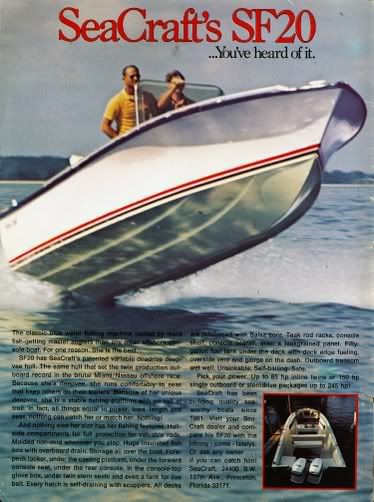
But, I still think we should stick with one hull, one picture, whichever WE decide. I feel it makes a better statement for other viewing the graphic on the front or back. If you have multiple pictures like that it honors all the boats, which is great but I think you lose the classic lines of the hull because the drawings are to small. Besides if we put all the boats on this years shirt what are we going to do next year?  Regardless, I will be buying a few anyway, just my .02 I'm biased but I vote for that 20SF picture. As a line drawing that would look awsome and let people know right away what a Seacraft is all about. Keep the discussion going, WE will come up with something.
__________________
May all your deadrise be variable. My 1973 SeaCraft 20SF Parker 2530 DVEC Boston Whaler 15 1984
|
|
#26
02-06-2007, 10:01 PM
|
|||
|
|||
|
Just an idea I had. How about a shirt of the actual line drawings from Mr. Moesly's hull patent, blue line on white shirts and white line on blue shirts with Classic SeaCraft logo.-Paul
|
|
#27
02-06-2007, 10:57 PM
|
|||
|
|||
|
I agree with Paul, simple is better. And colored lines on white shirts.
__________________
Cape Marine Supply
|
|
#28
02-06-2007, 11:34 PM
|
|||
|
|||
|
Looks like they might be running from JAWS!!! After he just took the chunk out of the bow!!! "looks like we're gonna need a bigger boat!!!"
|
|
#29
02-07-2007, 06:45 PM
|
|||
|
|||
|
Maybe a catchy phrase:
"Life's too short to own an ugly boat"
|
|
#30
02-07-2007, 07:40 PM
|
|||
|
|||
|
Whatever the design I would like to suggest they be 100% cotton - Beefy T's or comparable. The synthetic blends are not as comfortable in the heat of the summer and they don't hold up as well. Thanks for your hard work on the last version Peter. I am sure the next run will be just as good.
|
 |
|
|


 Linear Mode

